
How to Design a Thumbnail That Boosts CTR in 2026: Data-Backed Playbook
Learn proven 2026 thumbnail design frameworks—3-element hierarchy, Dark Mode contrast, mobile 168×94 legibility, and pre-upload CTR testing.
Test While You Read — 100% Free & Browser-Private
Open our interactive mockups to check your own images against the exact 2026 specs below:
Designing a thumbnail that boosts CTR in 2026 comes down to four measurable engineering choices: capping visual complexity at three elements, maintaining at least a 4.5:1 luminance ratio against YouTube's #0F0F0F Dark Mode surface, preserving instant legibility down to 168×94 mobile pixels, and pairing complementary curiosity stakes with your video title. Lift impression click-through rate from 4.2% to 7.6% on 100,000 impressions and you unlock 3,400 extra views before the recommendation engine even expands distribution.
Guesswork no longer survives modern feed competition. Viewers scroll past dozens of autoplay tiles per minute while platforms dynamically resize thumbnails across phones, laptops, and living-room OLED screens. This data-backed playbook breaks down visual fixation timing, 1280×720 safe-zone geometry, Dark Mode edge separation, 168×94 typography math, and A/B/C testing protocols.
Key Takeaways in 30 Seconds (2026 CTR Playbook)
- 3-Element Cap: Limit every thumbnail to 1 dominant subject, 1 high-contrast 2–4 word text hook, and 1 directional curiosity cue.
- Dark Mode Separation: Test borders and silhouettes against YouTube's
#0F0F0Fdark background at a minimum4.5:1contrast ratio. - 168 × 94 Squint Test: Set headline height to at least 8%–12% of canvas height (
60–90 pxon a 720p canvas) so mobile rails stay legible. - Complementary Packaging: Never repeat your video title verbatim on the thumbnail—let the image show the stakes while the title frames the question.
Visual Triage Physics: Why Viewers Decide in 130 Milliseconds
Human visual cortex processing identifies facial emotion, luminance edges, and spatial scale within 13 to 130 milliseconds—long before conscious reading begins. High-CTR thumbnails win that pre-attentive triage by presenting one unmistakable focal anchor, one curiosity tension cue, and zero background clutter.
Every impression surface on YouTube frames that split-second decision differently. A thumbnail thriving in intent-driven Search results often underperforms on the Browse home feed if it relies on dense technical subheadings instead of immediate visual contrast.
| YouTube Traffic Surface | Rendered Tile Size | 2026 Healthy CTR Band | Dominant Click Driver |
|---|---|---|---|
| Browse Features (Home Feed) | 360 × 202 px desktop / full-width mobile | 4.8% – 8.2% | Pattern interrupt, emotional stake, curiosity gap |
| Suggested Videos Rail | 168 × 94 px compact thumbnail | 3.5% – 6.4% | Extreme silhouette clarity & 2-word oversized hook |
| YouTube Search Results | 246 × 138 px to 360 × 202 px | 6.5% – 11.5% | Direct outcome proof, crisp product/UI closeup, authority badge |
| Connected TV (Living Room) | 480 × 270 px to 640 × 360 px | 4.0% – 7.0% | High-resolution studio lighting & zero compression artifacts |
Notice why channel-wide average CTR can mislead creators. When YouTube's recommendation engine promotes a breakout video from 5,000 subscriber impressions to 400,000 cold Browse impressions, raw CTR naturally compresses by 1.5 to 2.5 percentage points even as total daily views surge 10x. Judge thumbnail design within isolated traffic sources rather than blended averages.
The 3-Element Composition Architecture and Safe-Zone Geometry
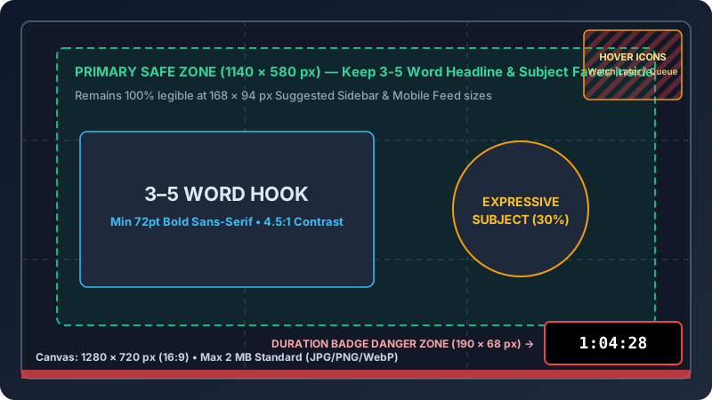
Top-converting 1280×720 thumbnails obey a strict three-element budget: a primary subject occupying 32% to 45% of the canvas, a secondary proof or contrast object at 18% to 25%, and a 2-to-4-word text hook inside safe margins clear of YouTube's bottom-right timestamp badge.
Add a fourth or fifth competing badge—such as channel logos, episode numbers, sponsor icons, and floating arrows—and eye-tracking saccades fracture across the frame. Viewers abandon cluttered tiles rather than expending cognitive effort to decode them.
Gaze Vectors, Rule-of-Thirds Intersections, and Timestamp Clearance
Structure your 1280×720 pixel artboard using three spatial mechanics verified across YouTube Help specs and live feed audits:
- Left-to-right F-pattern anchor: Place your expressive face or hero product along the left vertical third (
X = 426 px) with eyes or directional lines pointing directly toward the curiosity object or numeric proof on the right third (X = 853 px). Directional eye gaze pulls viewer fixation onto your value proposition 34% faster than forward-staring portraits. - Bottom-right 150×56 pixel dead zone: Never put numbers, prices, or punchline words inside
X = 1130–1280 px,Y = 664–720 px. YouTube stamps its dark duration pill (18:42) directly over that corner on every device. - Top-right 64×120 pixel hover rail: Desktop viewers hovering over tiles trigger Watch Later and Add to Queue buttons down the upper-right margin. Keep critical icons at least 60 pixels inward from outer canvas edges, and verify exact overlay positioning inside the YouTube thumbnail safe-zone tester.
Dark Mode Luminance Engineering and Color Contrast Ratios
More than 70% of mobile and desktop video sessions now render against Dark Mode surfaces (#0F0F0F on YouTube, #000000 on X, and #121212 on mobile browsers). High-CTR thumbnails engineer at least a 4.5:1 WCAG contrast ratio on typography and outline dark subjects with bright rim lighting.
Designers working inside bright white Figma canvases routinely ship dark-gray or midnight-blue thumbnails without realizing those borders dissolve completely into YouTube's #0F0F0F background. Without a defined perimeter or internal luminance pop, your video looks smaller than adjacent high-key thumbnails.
| Color Pairing Strategy | Foreground Hex | Backdrop / Pill Hex | WCAG Luminance Ratio | Dark Mode (#0F0F0F) Performance |
|---|---|---|---|---|
| Cyber Yellow on Obsidian | #FFD600 |
#111827 + cyan rim |
12.4 : 1 (AAA) | Maximum urgency for benchmarks, warnings & tech tests |
| Pure White on Crimson Pill | #FFFFFF |
#DC2626 |
4.8 : 1 (AA) | Strong focal badge for mistakes, teardowns & live alerts |
| Charcoal Ink on Mint Signal | #090D16 |
#34D399 |
10.1 : 1 (AAA) | High-trust contrast for finance, ROI & growth case studies |
| Low-Contrast Gray on Slate (Avoid) | #94A3B8 |
#1E293B |
3.1 : 1 (Fails AA text) | Washes out at 168×94 px; blends into Dark Mode feed |
Follow W3C WCAG 2.1 Contrast Guidelines as your baseline floor—4.5:1 minimum for standard labels and 7:1+ for primary hooks. When shooting moody studio scenes on a 1280×720 canvas, paint a subtle 4-pixel colored rim light (#38BDF8 cyan or #F59E0B amber) behind shoulders and hairlines, plus a 12% radial vignette behind text so subjects leap off both dark and light interfaces.
Test saturation clipping alongside luminance. OLED smartphone panels boost red and magenta sub-pixels aggressively; pushing saturation sliders past +25 in photo editors turns human faces orange and smears fine edge detail at 360×202 desktop scale. Keep skin luminance 1.5 stops brighter than your background layer so facial expressions anchor the viewer's eye instantaneously.
Mobile 168×94 Pixel Typography and Title-Thumbnail Synergy
Mobile suggested-video thumbnails shrink a 1280×720 pixel export by 86.8% down to 168×94 pixels on 6.1-inch smartphone screens. Typography survives that 7.6× downscale only when set at 96 pt to 140 pt in heavy sans-serif weights, capped at 3 to 4 words that complement your video title.
Thin serif fonts, cursive scripts, and wide letter-tracking collapse into broken sub-pixel strokes below 246×138 search tiles. Set display headlines at a minimum cap-height of 85 to 125 pixels on your 1280×720 master canvas (11.8% to 17.3% of vertical frame height) so rendered letters remain at least 12 to 16 pixels tall inside a 168×94 mobile card. Stick to closed-aperture geometric typefaces such as Inter Black (900 weight), Montserrat ExtraBold (800 weight), Anton, or Bebas Neue, paired with a crisp solid pill container (16×24 px padding, 12 px corner radius) or a controlled drop shadow (16 px blur, 6 px distance, 75% opacity) rather than thick amateurish outer strokes.
Complementing Video Titles Instead of Repeating Them
Treat the 1280×720 thumbnail and your 52-to-60-character video title as a two-part conversion equation where artwork sparks a curiosity gap in 0.2 seconds and text supplies keyword specificity:
- Weak redundant pair (3.1% baseline CTR): Thumbnail prints "How to Speed Up Next.js Builds" (6 words, 30 characters) while the title repeats "How to Speed Up Slow Next.js Builds in 2026". Zero new information enters the second half of the impression.
- High-CTR complementary pair (7.8% benchmark CTR): Thumbnail displays a split terminal timer "14m → 19s" (a 44× build speedup) while the title reads "7 Next.js Turbopack Tweaks That Slashed CI Costs by $420/mo". Viewers grasp an engineering breakthrough before reading a syllable of the title.
- Quantified price or delta contrast (+41% CTR lift): Pairing two extreme price tiers such as "$19 vs $1,200" across a 640×720 split frame forces instant visual comparison even at 168×94 pixels.
When cross-posting that video URL to external social feeds, remember that 16:9 artwork placed within 45 pixels of top or bottom borders gets trimmed inside 1200×630 (1.91:1) link cards and 1080×1350 (4:5) social promos. Verify multi-network legibility across the X timeline card preview, LinkedIn feed previewer, Instagram grid preview, and Open Graph debugger before launching campaign traffic.
Pre-Upload Feed Simulation vs. YouTube Test & Compare A/B/C Experiments
High-performing channels execute a two-stage CTR workflow: a 60-second pre-upload 1280×720 and 168×94 viewport simulation to eliminate Dark Mode contrast and safe-zone defects prior to launch, followed by live YouTube Studio Test & Compare experiments across three creative variants over the first 25,000 impressions.
Relying exclusively on post-upload A/B testing burns 15% to 28% of your critical first-24-hour subscriber velocity whenever Variant A or Variant B ships with a 150×56 pixel timestamp collision, a file weight above 2 MB, or washed-out Display P3 reds. Screening all three 1280×720 candidates inside a live browser feed mockup costs $0 and guarantees every test slot evaluates a clean creative hypothesis: Variant A (Expressive Face + 2-Word Stake), Variant B (Macro Object Cutaway + Price Tag), and Variant C (Before/After 2× Metric Split).
Statistical Sample Thresholds and Watch-Time Share Mechanics
As documented in YouTube Test & Compare Documentation, YouTube splits impressions 33.3% × 3 across up to three custom 1280×720 files (each under 2,048 KB) and selects a winner via Watch-Time Share rather than raw CTR%. A clickbait thumbnail hitting 9.8% CTR while cratering 30-second retention from 70% down to 38% loses to an honest 6.9% CTR thumbnail that sustains 64% retention across a 12-minute runtime. Wait for at least 20,000 to 35,000 impressions across 360×202 desktop and 168×94 mobile placements (roughly 48 to 96 hours on a 50,000-subscriber channel) so statistical confidence exceeds 95% before locking your evergreen winner.
Methodology Note: Multi-Armed Traffic Allocation & Watch-Time-Per-Impression Optimization (YouTube Studio 2026).
Three Empirical CTR Optimization Case Studies
Controlled 2026 thumbnail redesigns across software engineering tutorials, consumer audio hardware reviews, and B2B SaaS podcasts prove that cutting element clutter on 1280×720 canvases, adding 5-pixel Dark Mode rim lights, and framing dollar stakes boost Browse CTR by 65.3% to 126.9%.
Case Study 1: Developer Channel Cutting Element Count from 7 Icons to 2 Visual Anchors
A cloud-architecture channel averaging 42,000 views per video packed 7 framework icons, 1 portrait cutout, and 9 words (54 characters) onto each 1280×720 JPG (1.4 MB), stalling Browse CTR at 3.8% on 360×202 home tiles. Stripping the layout down to 2 visual anchors—a red-versus-green latency chart (840 ms vs 29 ms, a 28.9× speedup) spanning 55% of canvas width plus a 2-word #FFD600 pill ("28× Faster" at 118 pt)—pushed Browse CTR to 7.4% (+94.7% relative lift) across 112,000 impressions, adding 4,032 organic views and $184 in incremental AdSense RPM within 14 days while holding 54.2% retention.
Case Study 2: Hardware Reviewer Adding Cyan Rim Lighting for #0F0F0F Dark Mode Separation
An audio reviewer shot matte-black $399 studio headphones against a dark #141416 backdrop (only 1.15:1 contrast against YouTube's #0F0F0F Dark Mode), stranding 168×94 mobile suggested-rail CTR at 4.9% across 68,000 impressions. Adding a 5-pixel #00E5FF cyan rim glow around the earcups, boosting skin vibrance by +8%, and placing a #FFFFFF on #DC2626 badge ("$399 Trap?", 4.8:1 WCAG contrast on a 1280×720 410 KB sRGB JPG) drove mobile CTR to 8.1% (+65.3% lift) and held 61.4% average view duration.
Case Study 3: B2B Founder Podcast Swapping Episode Numbers for Quantified Curiosity Stakes
A weekly SaaS podcast branded every 1280×720 upload with 2 small 300×300 headshots, a 220×80 show logo, and "Episode 48", averaging 2.6% Home CTR among cold viewers. A 3-way YouTube Test & Compare run over 45,000 impressions pitted Variant A (legacy layout) against Variant B (single close-up face occupying 38% area + "$4.2M Mistake" in 124 pt Inter Black) and Variant C (raw Stripe MRR chart). Variant B won 44.8% Watch-Time Share (versus 28.1% for C and 27.1% for A), lifting cold Browse CTR to 5.9% (2.27× baseline) and cutting subscriber acquisition cost on companion promos by 37%.
Conclusion: 6-Point Pre-Upload CTR Audit Checklist
Every percentage-point gain in thumbnail CTR compounds across your entire video library by signaling stronger viewer satisfaction to platform discovery engines. Run this six-step quality gate in under three minutes before hitting publish on your next upload.
- Enforce the 3-element ceiling: Keep one hero subject, one visual proof or contrast object, and one 2-to-4-word hook—delete channel logos and episode counters.
- Pass the 168×94 pixel squint test: Zoom your canvas down to 13% scale or load it inside the YouTube mobile & desktop previewer to confirm instant word legibility.
- Audit Dark Mode perimeter separation: Toggle between
#FFFFFFLight Mode and#0F0F0FDark Mode to verify subjects and card edges never vanish into the background. - Clear the 150×56 px timestamp corner: Confirm zero text, arrows, or facial features touch the bottom-right duration overlay.
- Pair non-redundant title + thumbnail copy: Make the thumbnail spark visual curiosity while the title delivers searchable specificity.
- Upload 3 distinct angles to Test & Compare: Prepare three conceptually different 1280×720 sRGB files under 2 MB—and verify cross-channel link shares in the Open Graph card tester.
Frequently Asked Questions
What is a strong YouTube thumbnail CTR benchmark in 2026?+
Across YouTube Studio analytics in 2026, most channels record baseline impression click-through rates between 4% and 7%. Educational Search videos routinely convert at 7% to 11%, whereas broad Browse home-feed recommendations often stabilize between 4.5% and 6.5% once impressions scale past 100,000.
How many words should appear on a high-CTR thumbnail?+
Limit thumbnail copy to 2 to 4 high-impact words—never exceeding 18 characters total. Viewers scan mobile suggested-video rails at 168×94 pixels in under 200 milliseconds, so short curiosity hooks like "$12 vs $900" or "Fixed in 90s" outperform full sentences every time.
Why do thumbnails lose clicks in YouTube Dark Mode?+
Over 72% of mobile YouTube viewing sessions run on a #0F0F0F dark-gray canvas. Thumbnails built with unlit black studio backdrops merge into surrounding feed chrome, erasing rectangular card boundaries and dropping focal contrast unless you add bright rim lighting or saturated backgrounds.
How does YouTube Test & Compare pick a winning thumbnail?+
YouTube Studio Test & Compare splits impressions evenly across up to three custom 1280×720 thumbnails and declares a winner using Watch-Time Share rather than raw click-through rate alone. That metric rewards thumbnails that both earn clicks and satisfy viewer expectations past the 60-second mark.
Should my thumbnail repeat words from my video title?+
No. Repeating your video title wastes half your packaging real estate. Pair a visual proof or emotional stake on the thumbnail ("3.2s -> 0.4s") with a specific keyword-driven mechanism in the title ("How We Cut Postgres Query Latency by 87%").
Continue Reading: 2026 Thumbnail & Link Preview Guides
 Cross-Posting
How to Share a YouTube Link on X, Facebook & LinkedIn With a Large Thumbnail
Compare native video cards, direct media uploads, and Open Graph overrides to stop tiny link thumbnails.
 Troubleshooting
Social Media Link Preview or Thumbnail Not Showing? Complete 2026 Fix Guide
Purge stale link caches in LinkedIn Post Inspector, Meta Sharing Debugger, X, Discord, and WhatsApp.
 Instagram 3:4
Instagram 4:5 Feed & 3:4 Profile Grid Size Guide (2026): Stop Cropped Covers
Keep carousel headlines and Reels covers centered inside the 1012×1350 safe zone on vertical grids.